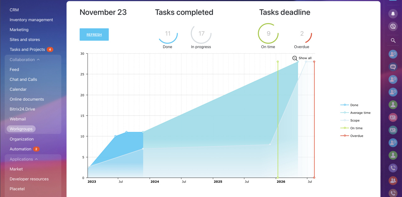
The Burnup Chart app is designed to track estimated time of project completion. Now, at any moment, you can view estimated time when a project will be completed, if you have appropriate access permissions for this project. The app itself is launched from within a workgroup.
The Burnup Chart app displays project completion chart based on a number of tasks at specified time. If you didn't select a project or selected a project without any tasks, you will see the “overview” chart with demo data.
If you're involved in project management and need to overview project deadlines based on the number of tasks required to complete, this app might be a well-suited option for you. It works in real-time and let's you visualize the estimated time needed to finish a project.
After installing the app, go to any of your existing projects or create a new one. You'll see the Burnup Chart tab. Click on it:
The app gives you a visual overview of meeting your project deadlines.
There are two types of data that the graph builds upon:
- Y-axis: the number of tasks within the project
- X-axis: project timeline
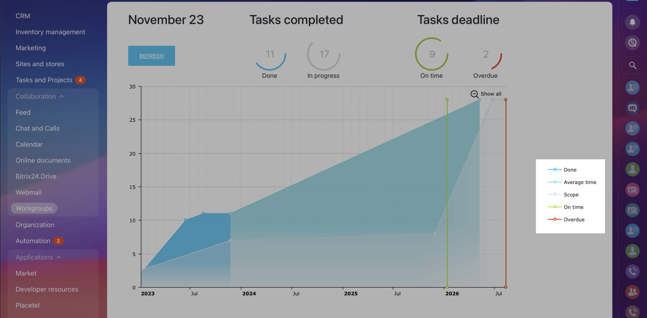
- Done – shows you a trend of completed tasks over a timeline
- Average time – a rough time estimate for completing all of the project’s tasks
- Scope – total number of tasks
- On time – the estimated soonest date of completing a project
- Overdue – the time you are not expecting to exceed for project completion
You can customize the graph presentation by toggling each of the lines/areas on and off.
When hovering over your graph, you can zoom in and out by scrolling your mouse wheel. To reset the view click the Show all button in the upper right corner:
On the top of the graph, besides the current date, you see:
- A refresh button – allow you to manually refresh the graph’s data quickly without refreshing the page
- Tasks completed – shows the number of completed tasks against the uncompleted
- Tasks deadline – shows the number of tasks completed within their deadlines and outside of them
The project deadlines are derived using the following formula:
=(scope / (scope + median)) * project_interval
Where:
Scope - total number of tasks
Median - median deviation from the plan
Project_interval - the interval of the project: from start to deadline
See also:


.jpg)
