In Bitrix24, you can see how your site looks on smartphones or tablets and make real-time edits. This helps you optimize your site for mobile devices, ensuring a smooth and engaging experience for your visitors.
In this article:
View the mobile version of your site
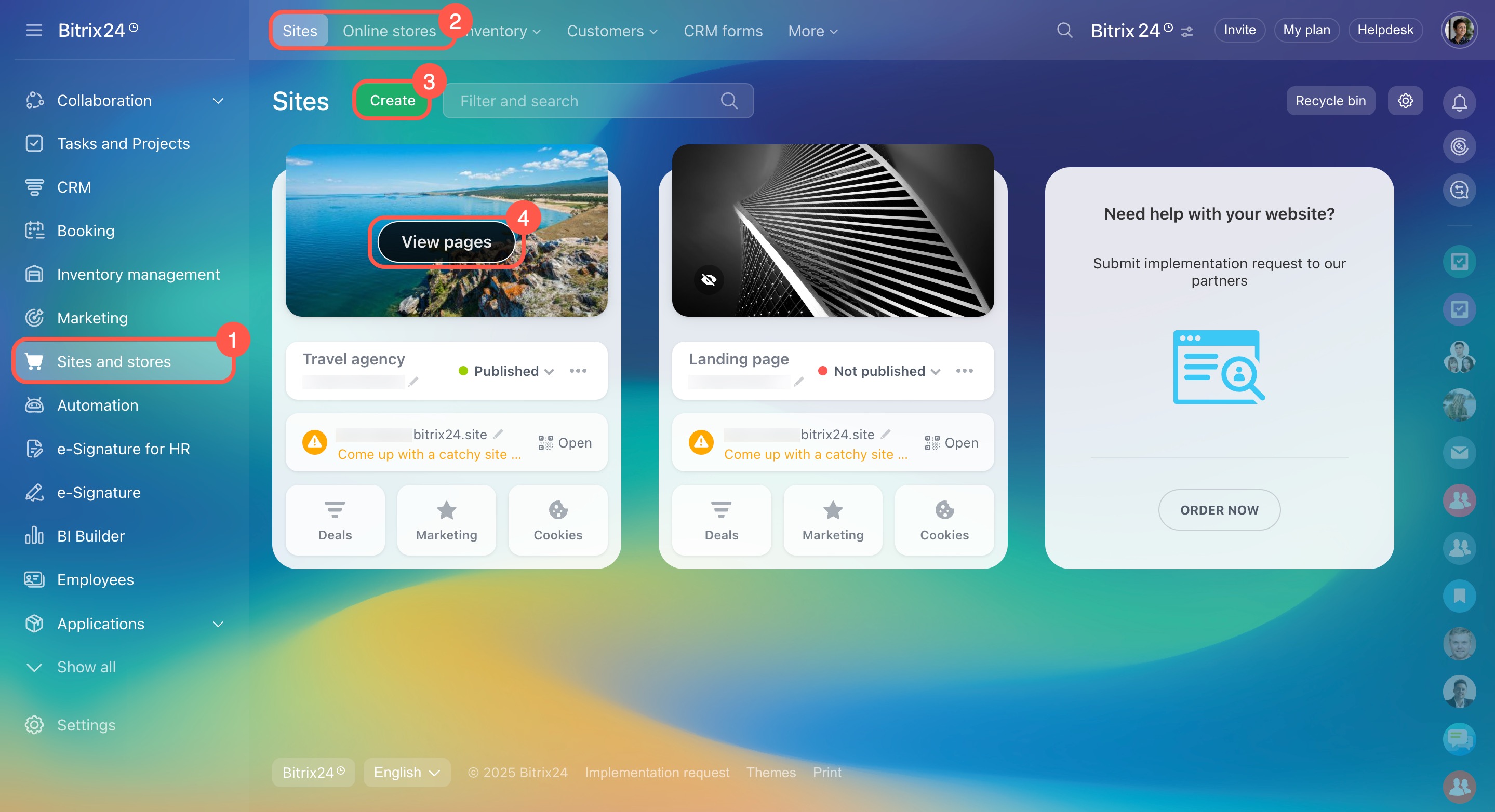
- Go to Sites and Stores.
- Select Sites or Online stores.
- Create a new site or choose an existing one.
- Hover over your site and click View pages.
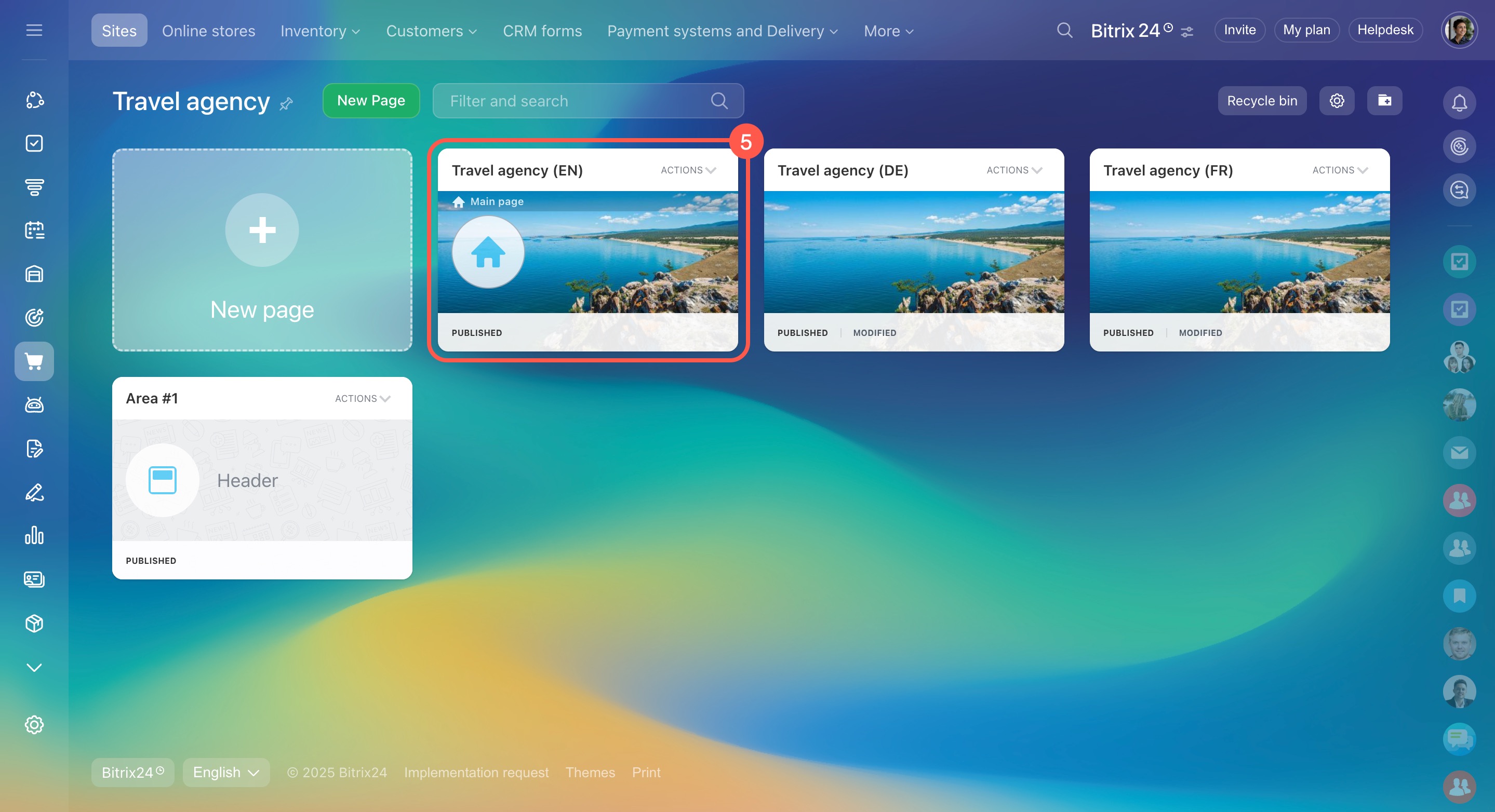
- Click the page you want to view in mobile format, and the editor will open.
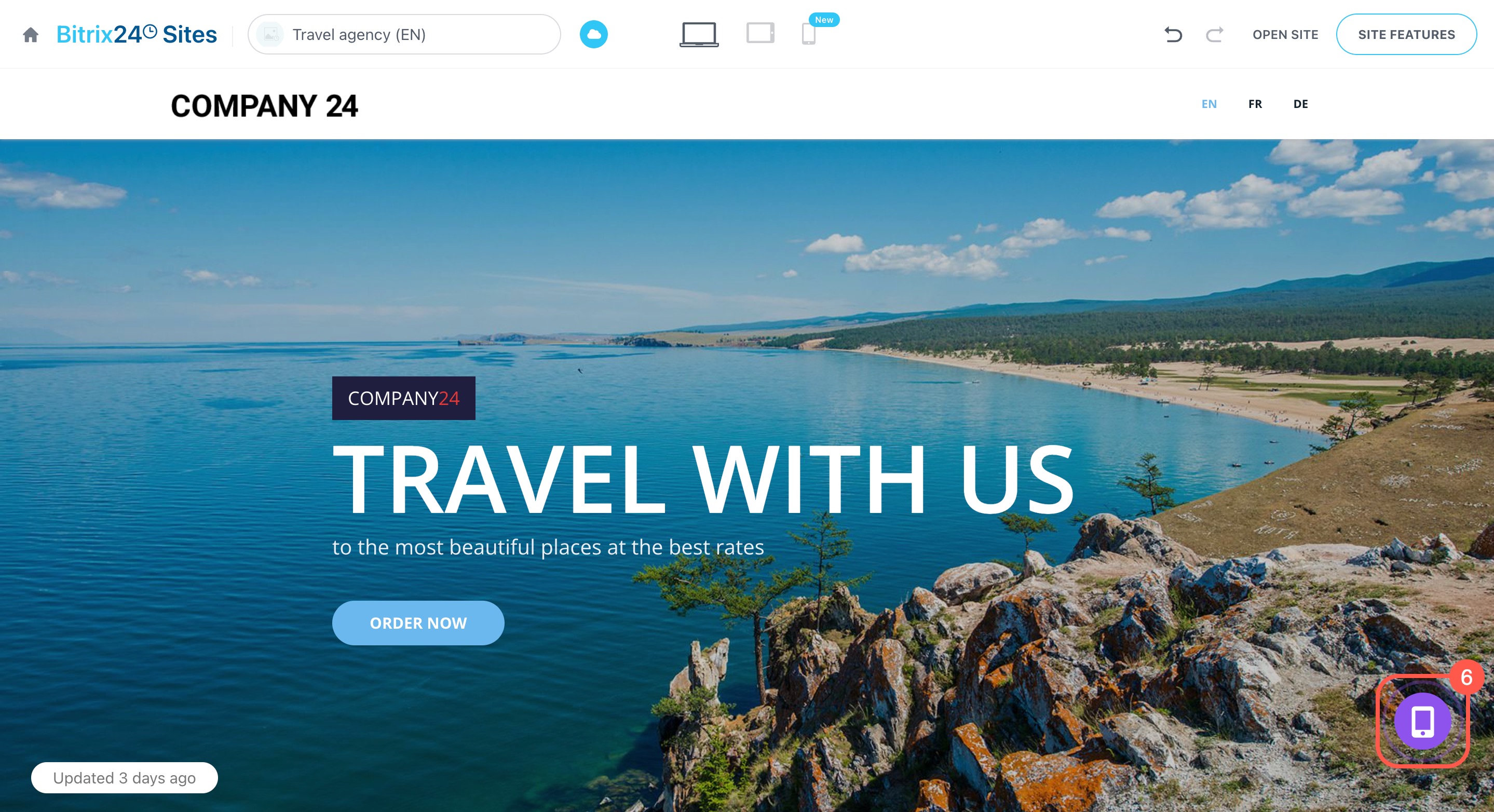
- Click the widget in the bottom right corner.
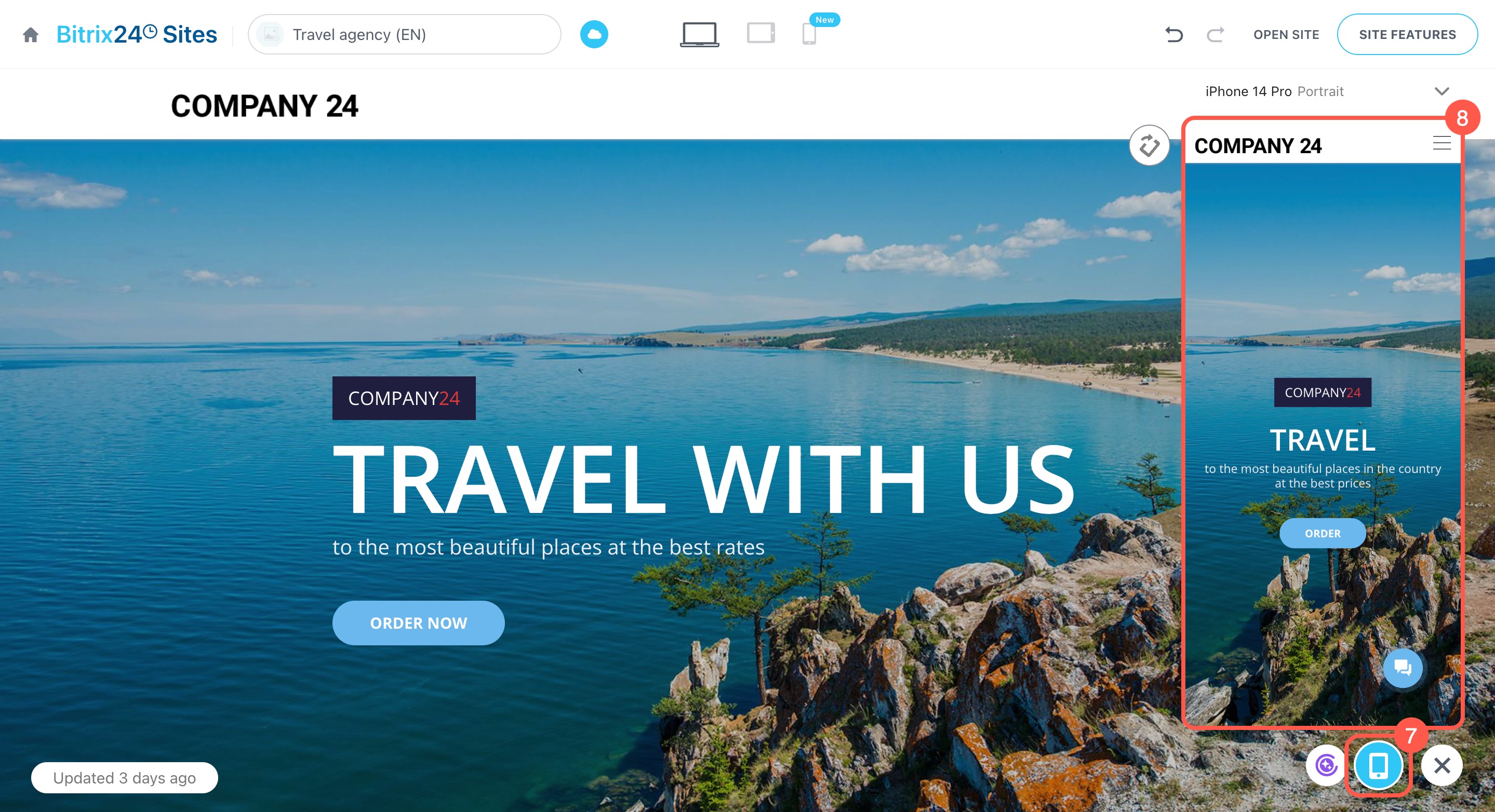
- Select the smartphone icon.
- A preview of the mobile version will appear.
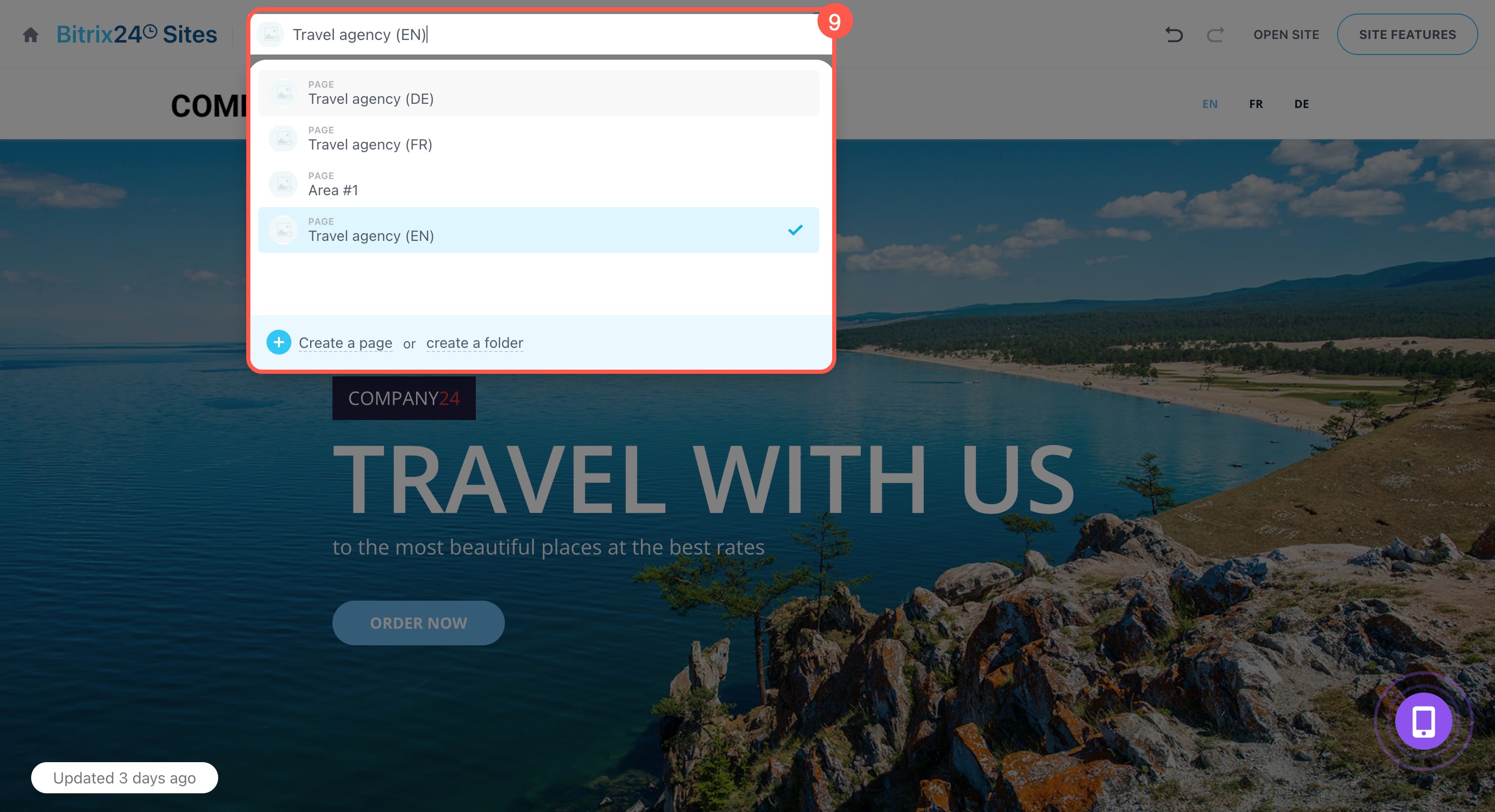
- To view a different page, choose it from the menu.
Create and configure your Bitrix24 site
Create an online store in Bitrix24
Check how your site looks on different devices
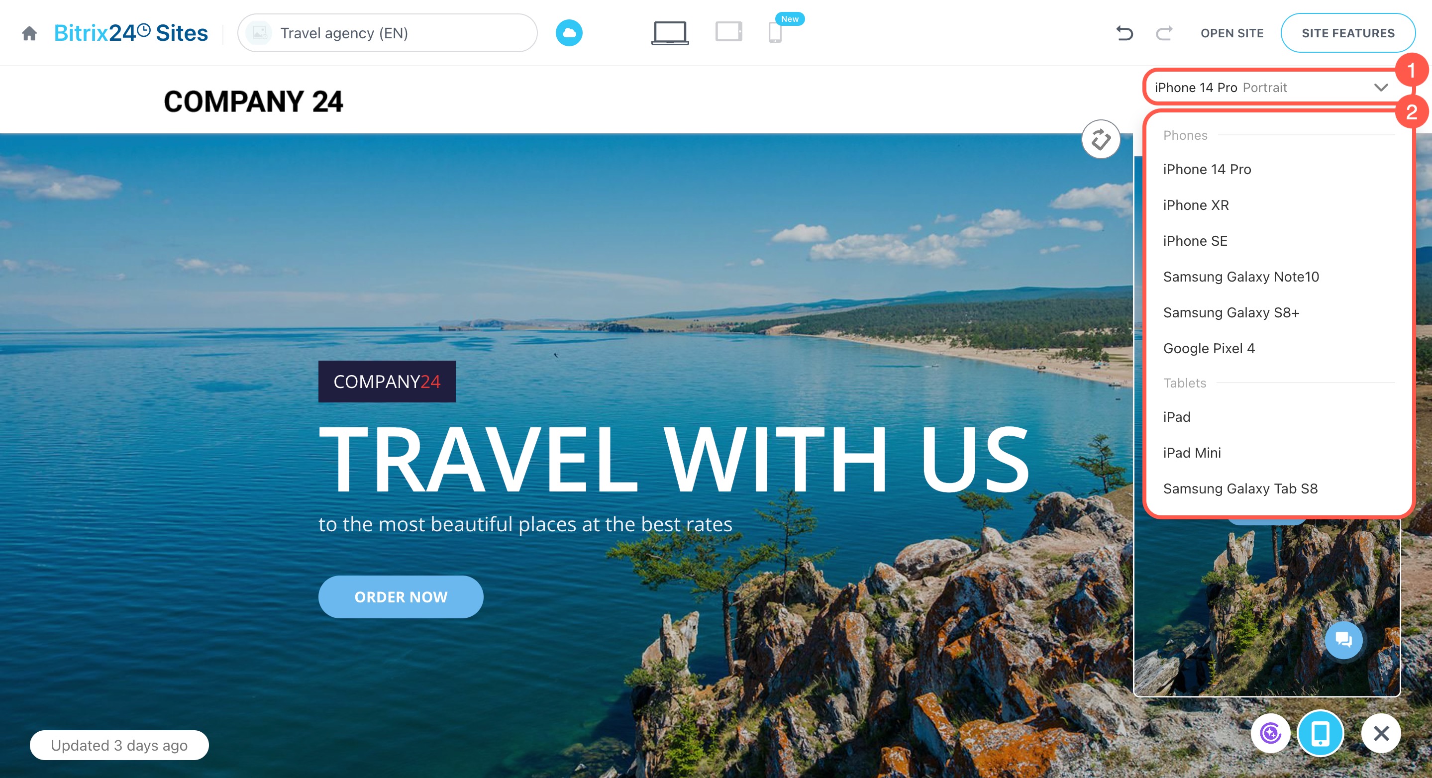
You can see how your site appears on different smartphone and tablet screens.
- Click the
 icon next to the mobile device name.
 - Choose the model you want to preview.
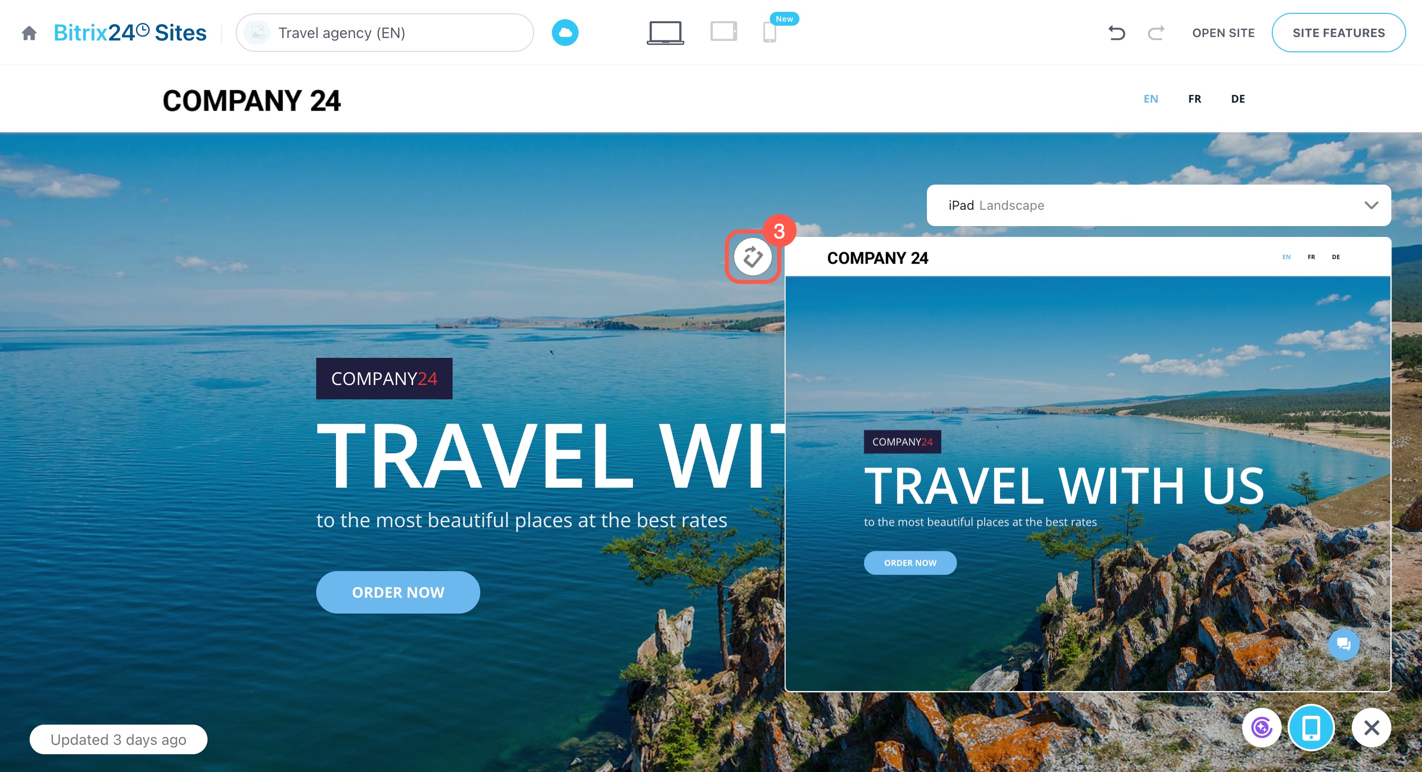
- Click the
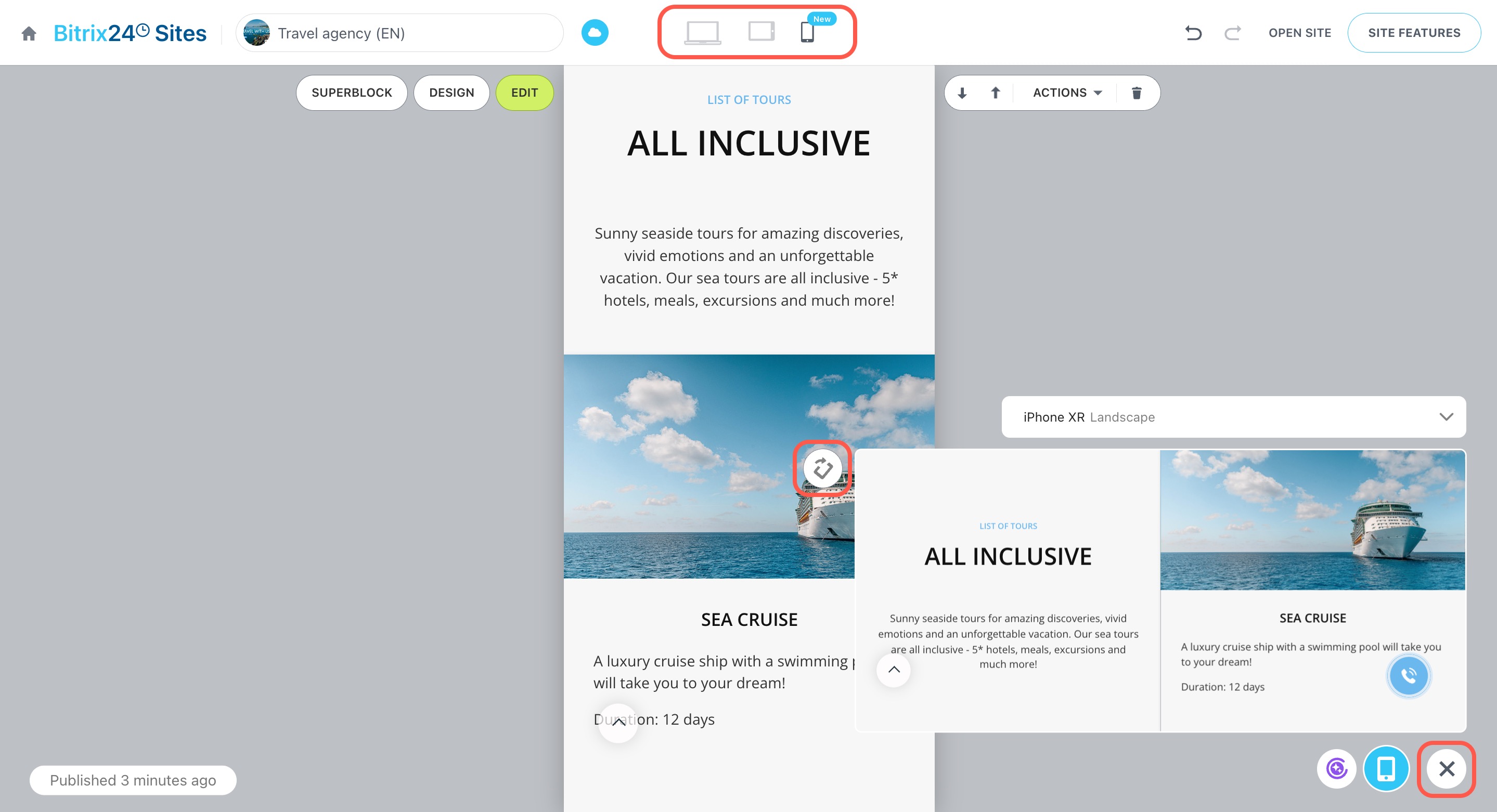
 icon to switch between portrait and landscape view.
Edit the mobile version of your site
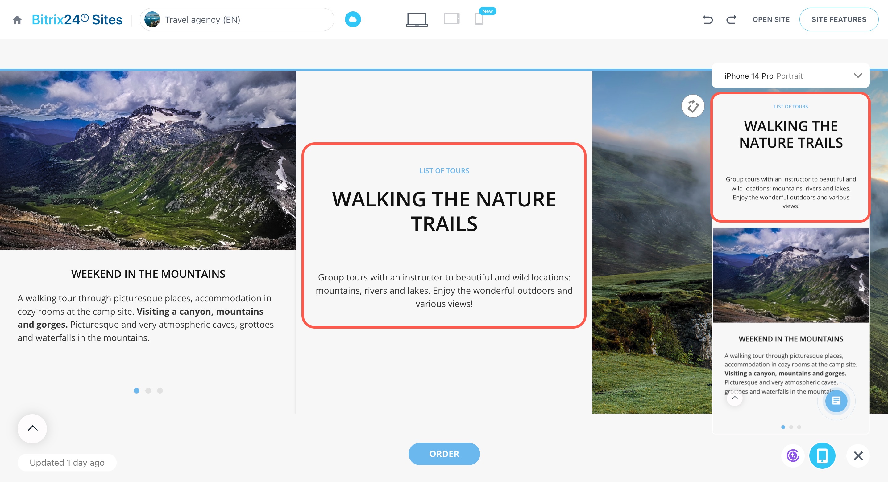
When you update blocks, backgrounds, text, or design, the changes apply to all versions of your site. Preview how everything looks on mobile devices using the window on the right.
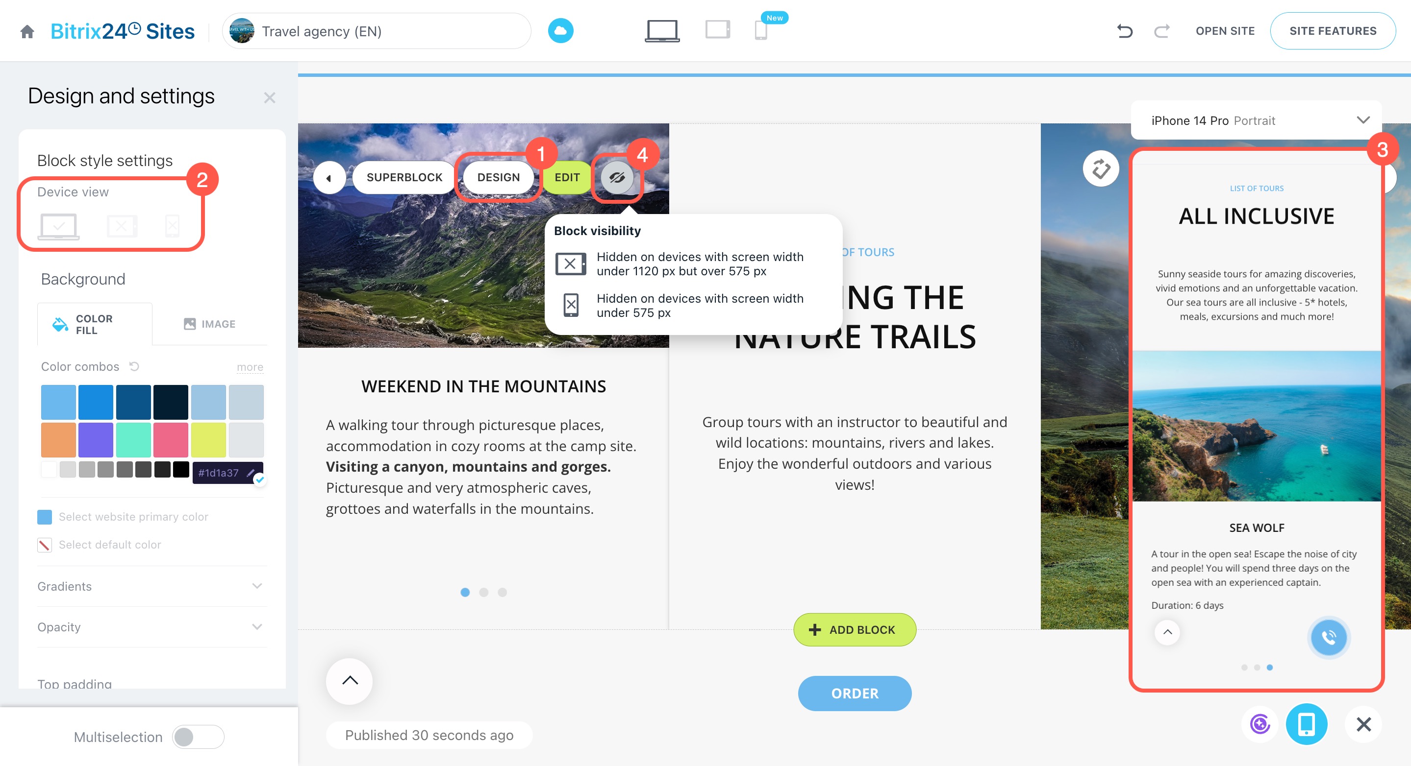
If a block doesn’t work well on certain devices, you can adjust its visibility separately for desktops, tablets, and smartphones.
- Click Design.
- In the Device view section, choose where the block should appear. If you mark a device with a cross, visitors using that device won’t see the block.
- Use the preview window to see how the mobile version looks on the selected device.
- Hidden blocks are marked with a special icon
 . Hover over it to view visibility settings.
If the mobile version is your priority, click the device icon at the top of the editor. The site will adjust to fit the selected screen size. You can also rotate the preview window to see both portrait and landscape views. This will help you make better design choices.
To close the mobile preview, click the cross (X) in the bottom right corner.
In brief
-
In Bitrix24, you can see how your site or store looks on smartphones and tablets and make real-time edits.
-
To preview the mobile version, go to Sites and Stores > Sites or Online stores, open the site in the editor, and select the smartphone icon in the widget.
-
Check how your site appears on different device models and switch between portrait and landscape views.
-
Any changes to blocks, backgrounds, text, or design apply to all versions of the site.
-
Adjust block visibility for desktops, tablets, and smartphones to optimize the user experience.
-
For focused work on the mobile version, use the device icon at the top of the editor to adjust the site to the selected screen size.

